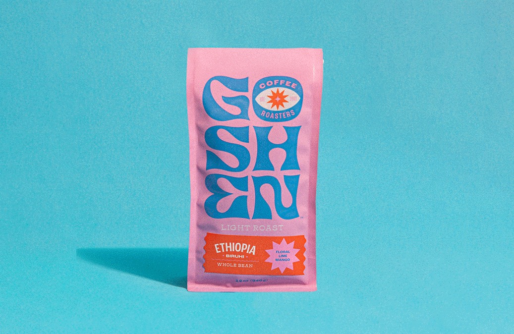
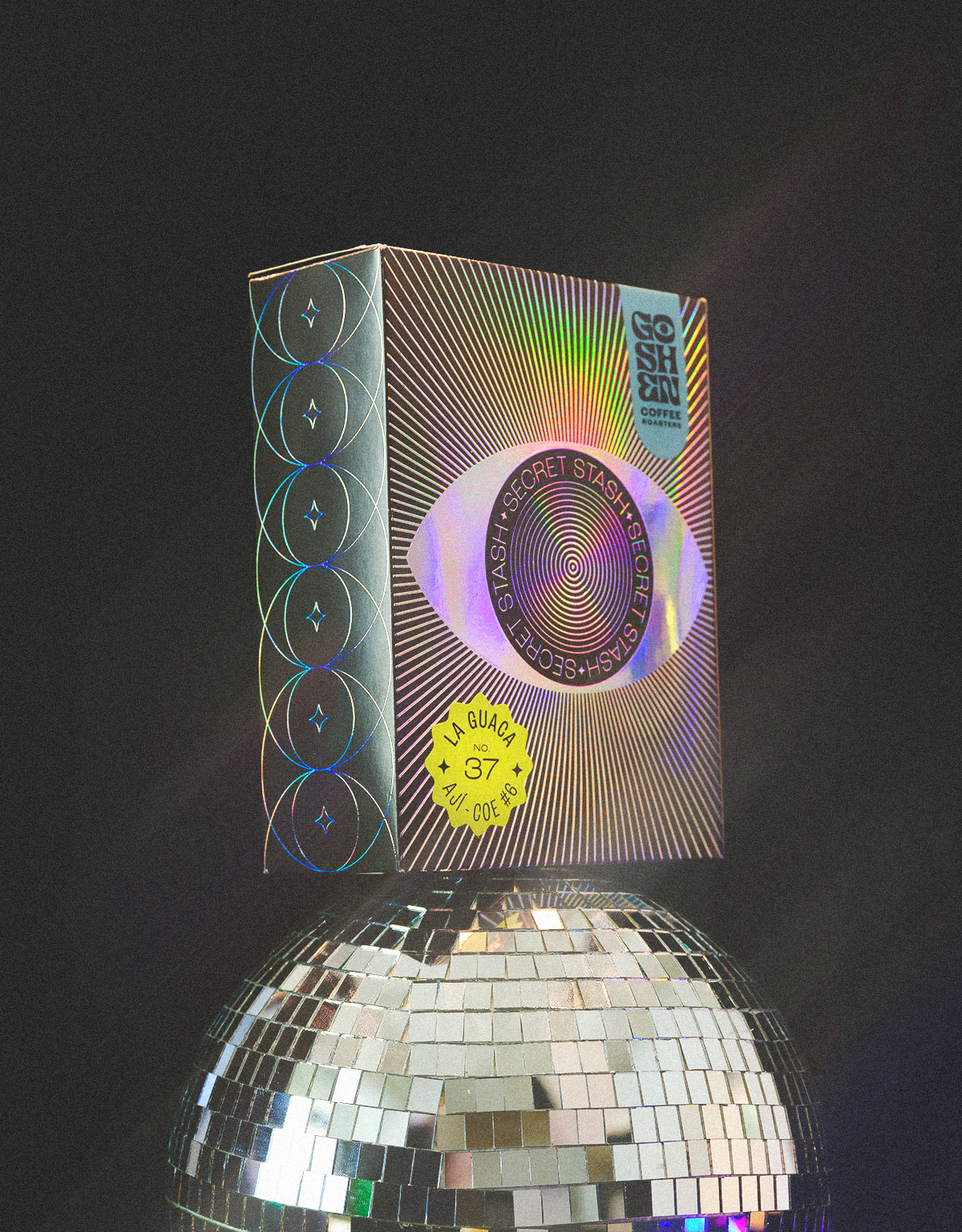
Goshen Coffee Roasters
Twenty years of masterfully roasted coffee had earned Goshen a loyal following and plenty of potential to expand. What they lacked was a visual identity that resonated with their audience — and a brand idea to inspire it. To help Goshen stand out on intensely competitive retail shelves and draw more visitors to their cafes, we infused unexpected meaning into the brand name. “Goshen” became a symbolic mashup of the words “Good Shit Energy,” and a North Star for the unapologetic and positive vibe of the new brand.
Visual Identity
✏️
Logo Design
✏️
Packaging
✏️
Brand Story Development
✏️
Visual Identity ✏️ Logo Design ✏️ Packaging ✏️ Brand Story Development ✏️